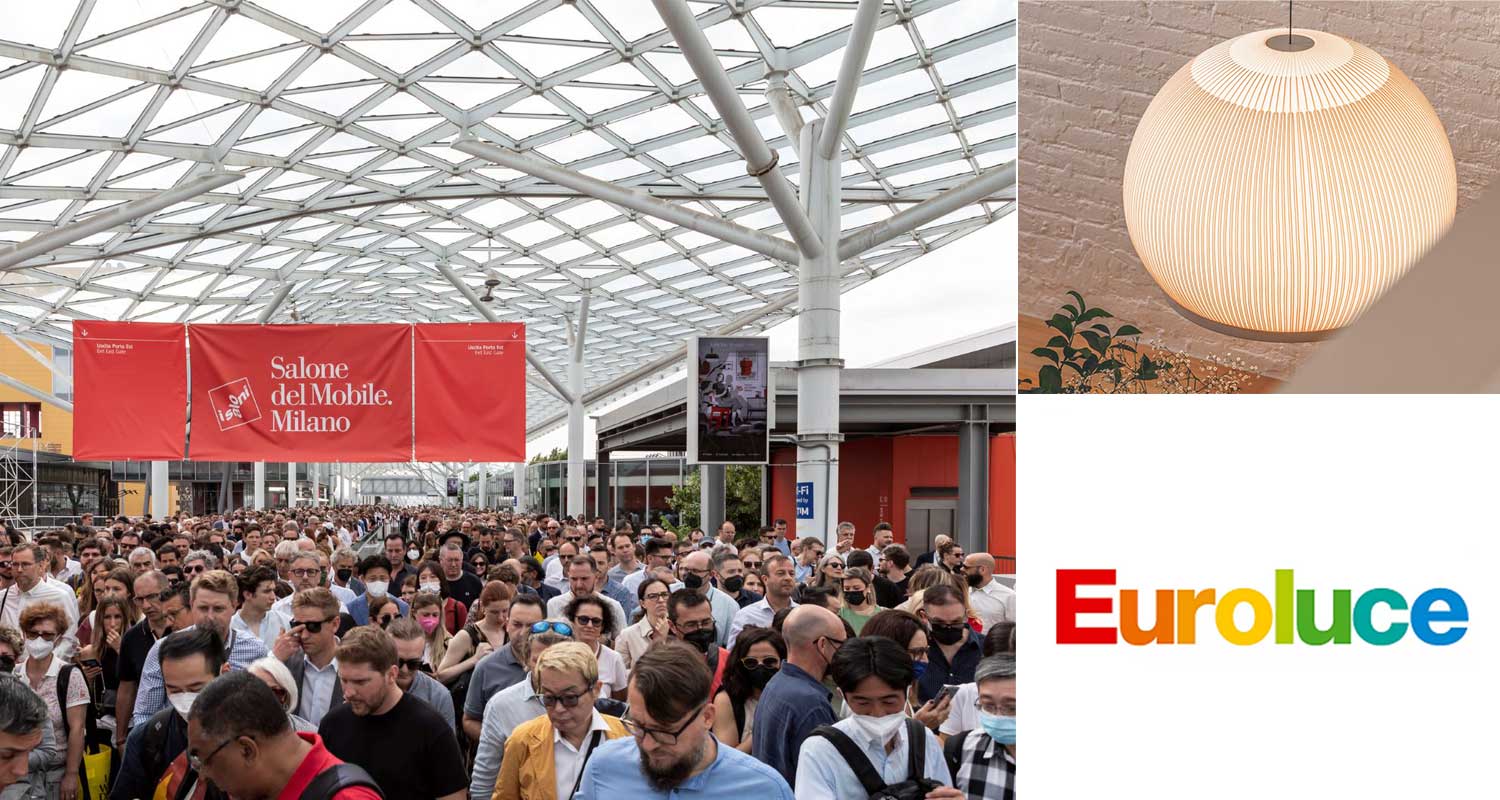
Boyd Lighting’s Schuyler Sweet reports on his findings on day one of the year’s largest lighting show, Euroluce at Milan’s Salone.
Over 360,000 people have descended on Milan for the annual pilgrimage to the international furniture exhibition Salone del Mobile.
Every other year Salone hosts Euroluce, the largest lighting show of the year showcasing many European and international brands.
Every time I come to one of the European shows I am energized. The time, money, and effort these companies put into their booths is on another level than what we see in the U.S. Whether the brands are highlighting new products, like DCW éditions Paris, creating unique vignettes like Vibia, or providing artistic installations like Lasvit’s, the scale of these booths allows the fixtures to breathe, and us the opportunity to walk around and see them as we would in a home or hotel.
Overall theme this year:
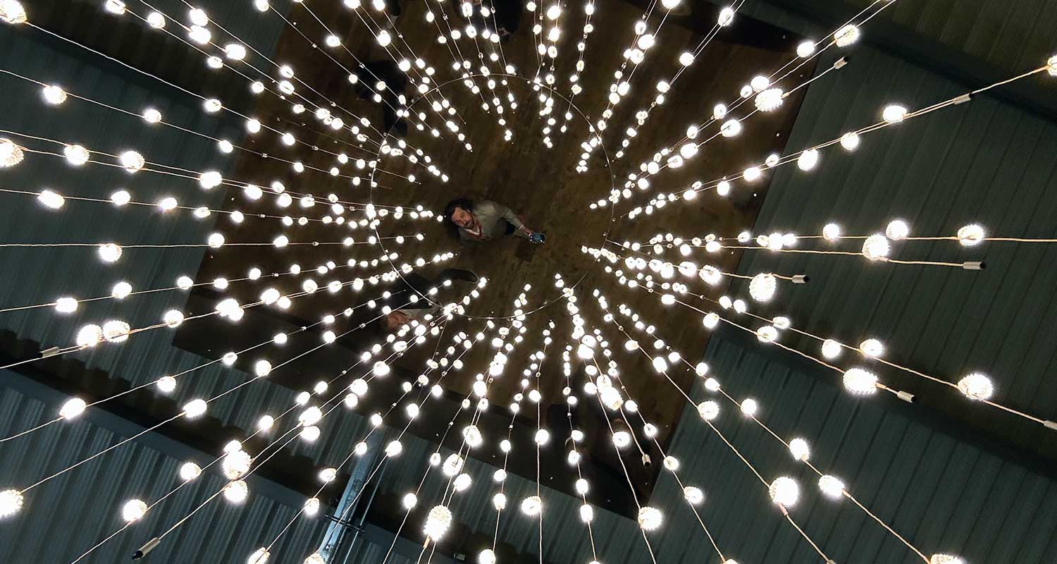
Thin wires. It seems like everyone in Europe is using small cables to power their LED fixtures.
A few favorites within this theme:
Davide Groppi continues to push the boundaries of slim. It’s amazing to see what he is able to create with these fixtures that are no more than 3mm thick. Unlike the approach in the U.S., Europeans don’t worry about the tiger striping or visual imaging of individual LEDs. We Americans also have UL to contend with, which doesn’t allow for one to physically touch an LED. In Europe, they avoid diffusers altogether, creating the most minimal fixtures possible.
Luce Plan makes lighting that is phenomenally simple, unique, and systemizable. They have created large pendants that can be endlessly modified with smaller wire and acrylic “flowers” that can be systemized purely by coiling the individual pendants to the low-voltage wires hanging from the canopy.
Favorite new find:
Formagenda, founded by Benjamin Hopf in 2008, has created some really neat architectural glass pendants with a 45-degree bevel, available in multiple colorways. They do not have UL yet, so Americans will have to wait, but Hopf designs for big brands with a focus on the form of the fixture first—which I think we can all appreciate.
Fun and playful:
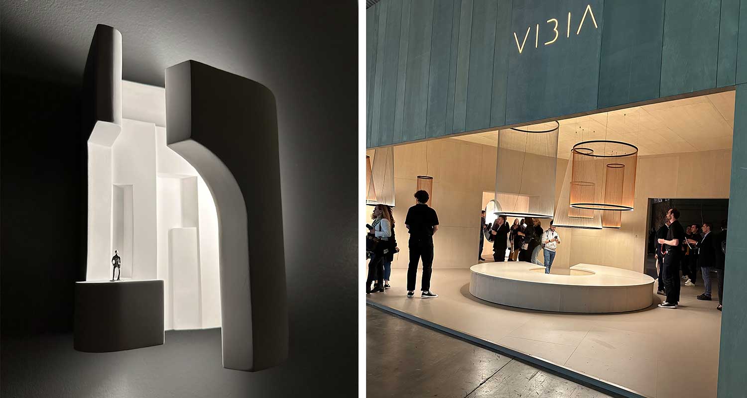
I met the team of DCW éditions Paris at LEDucation in March, and they brought their A-game to Euroluce. They have some fun and unique Parisian-inspired plaster sconces playfully adorned with little figurines. Their other designs utilize brass and glass, but still feel a little quirky and very true to themselves. I really appreciated the large system on the front of their booth. It drew me in.
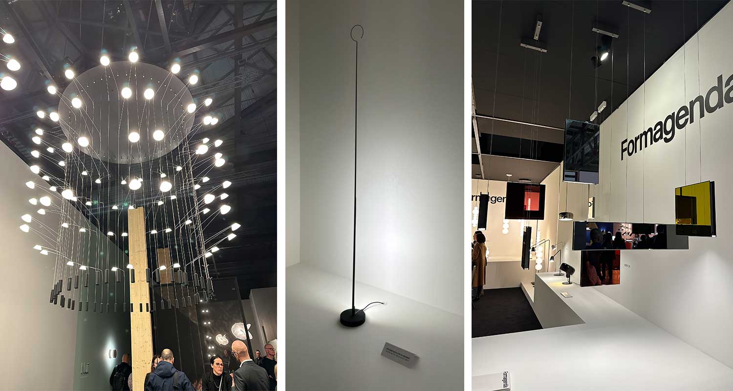
Michael Anastassiades has his own booth this year, with beautiful warm wood and polished brass. It feels like an homage to his designs over the years, and while it is not an installation of epic proportions, like what Flos did with dozens of his designs several years ago, it is a great timeline of who he is and how he has evolved as a lighting designer.
The Big Two: Flos and Vibia
Honestly, I was a bit underwhelmed by Flos this year. They had repeatable lighting elements programmed to create some nice installations and offered some fun colors on the portables, but overall the theme felt extremely architectural and the booth felt very corporate.
While Flos’s booth was completely enclosed, Vibia utilized openings in the booth to allow for sneak peeks into the space, creating a desire to enter. They went for a natural color and softer texture on the walls, making the booth warm and inviting. Inside were really nice vignettes featuring some products we know, and some very cool new products. In my humble opinion, they absolutely nailed it.
Overall a great day one!
Visit Boyd Lighting
